← Blog

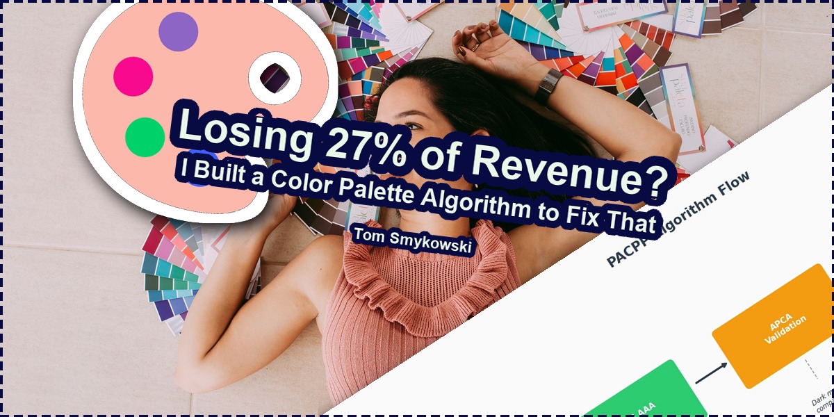
🎨 You May Be Losing 27% of Your Revenue; I Built a Color Palette Algorithm to Fix That

🎨 You May Be Losing 27% of Your Revenue; I Built a Color Palette Algorithm to Fix That
Photo by Helena Lopes from Pexels

I'm blessed in some ways because I was born in Poland. Living in Europe wires you differently about diversity. And that perspective led me to build something that could save your business 27% of potential revenue.

I have to admit, I'm blessed in some ways because I was born in Poland. It's quite a big country in Central Europe. It's easy to fly from here to Barcelona, Paris, Madrid, Stockholm, Oslo, and to Croatia too. We can fly also to the east, but few people do it now. But we have Latvia, Estonia northeast so that's great too.

Living in such a place teaches you about the diversity of the world around you. I wouldn't learn so much about it if I drove 20 hours in any direction and everyone would speak the same language and be part of roughly the same culture. Being in Europe wires you differently. And that's something I love.

The other day I was in Barcelona at El Gótico, and it was great. Old city, a lot of people, but still it has the true vibe of old Barcelona. You go to Poblenou and you have an entirely different vibe. Modern, beaches, startups, just like San Francisco. Even in one city everything is different, and Barcelonians embrace it.

Anyways, that trip made me think about how people are different. And we live in a world where we should know about it. From the founder and engineer perspective it's something that was always clear for me as the sun too. That when you walk a pavement, the pavement can be ok, but when you drive with a car, it can be a bumpy ride.

The Two Pillars of Global Scale

Designer working with color samples
Color palette selection process. Illustration 1: "Smiling designer sitting at desk with color samples" by Helena Lopes from Pexels, Pexels License

In terms of equal access to technologies, nothing matters now more than internationalization and accessibility. Internationalization is a process of making your app translated to other languages. This is important. Especially if you run literally any service that you want to gain global scale, you can't just assume people will use it in English language and call it a day.

If you want to scale to Europe but also to Canada, South America, Asia, Africa, you have to support languages. Not only that, because also date and time formats and so on, but languages are important. There's no excuse to not do that. I've worked a lot on internationalizing services and it always gave tremendous results.

Out of my projects Resume Hedgehog is translated to twenty languages and it's great, because now my reach rose from 1.5 billion people to 5.5 billion people, more or less, I'd say around up to four times. And that's not that difficult nowadays.

Especially since we have global teams, global networks. If I'm in United States right? And my friend is French, I found this great tool, and share it with him, he doesn't know English, so he can't use it. And he won't pass it further to his boss of some French company that will want to do business with me. We think so individualistic, instead of groups and networks, that we forget that obstacles break these groups and networks and dramatically lower scaling factors that are based on effects of global accessibility in all terms.

The Accessibility Gap Nobody Talks About

Another thing that breaks these chains and prevents scaling global business is accessibility. I've worked with organisations and people who are focused on this area, and they work also with people who have needs that surpass anything that we could easily offer. They have to use special tools and methods to interface with apps and internet. This is a different set of problems.

But there's a wide range of people who are on a scale and they need accessibility too. Actually out of 100 people, 27 people have problems accessing apps and websites because of lack of accessibility. Again, if someone is privileged, he doesn't know or care about such issues. But people have macular degeneration, cognitive fatigue, ALS, worn down displays, cataracts, low vision and so on.

And when I say about it, I have to be honest. The reception is poor. Look, I have perfect sight, I have because I work a lot on user experience, UI, so that is a must have. But why when I say about it I get that look: "He has conditions? Maybe he's not a good fit?". That's the strangest feeling and if I have that feeling I just know that I'm not talking with people capable of scaling their business.

I have no conditions, but I know about them, because I educated myself. Now, if my business would lose 27 thousand dollars out of 100 thousand dollars, I would say it's something worth investigating. And this is potential loss from ignoring accessibility.

Financial charts showing revenue impact
Revenue impact visualization. Illustration 2: "Close-up of colorful financial charts" by RDNE Stock project from Pexels, Pexels License

The Color Palette Problem

And lately I was reading the great book by Adam Dannaway called Practical UI to refresh UI design principles, and there's this great chapter on page 113 about choosing the right color palette for your app, website, whatever you code or vibe code. It's really great, but what made me think, because Adam offers an algorithm to choose a palette. Is it possible to choose a palette that is accessible out of the box? Not leave accessibility as something we take care of later but just start a project with a palette that is accessible from the start.

And that's how I built PACPP. In fact before I built PagePerson Insight, it's a tool you can use to analyse your app against various conditions and see what is right, what is wrong. Basically what people will see and what not. It goes beyond vision issues, but also cognitive, education, mental, and even mixup to see how people in roles like CTO, CEO, CFO will understand your website.

So naturally I wanted to check if I can also create a palette picker that just prevents people from doing mistakes a lot of founders do. And a lot a lot. So it's a competitive advantage. Moreover, I'd say, no, AI won't help you with that much. Because the rules for good palette are all over the place.

Why AI Can't Solve This (Yet)

For example we have WCAG AAA standard. But AI doesn't fully understand it. So it won't generate accessible interface even if you ask it to. No, Fable won't too. And even if yes, WCAG AAA in its current form is a bit outdated however it's a compliance standard, and the research on the subject has gone further.

We have for example APCA, a new standard of measuring a good contrast of user interfaces that works for dark modes well, and for edge cases where WCAG was either too strict or too relaxed. It comes with baked in some of the most important science results we have to date. WCAG will soon have something similar too.

And then we have also other things people don't mention. We have many other conditions that cause people to have trouble using websites and apps. And even APCA doesn't include them. For example, bright red color as brand causes literal stress in some people, so we should really not use it.

Also we shouldn't use too flashy colors, because it's bad for people with anxiety. Too dull colors are hard to read by everyone. And when you dig into it, creating a palette isn't that easy. If you follow AAA and APCA rules and the mentioned and more conditions, you have to adjust all colors between each other to achieve the good contrast ratio between all moving parts.

You have a button on a background - they have to have good contrast. Text on a button versus button background - too. Fill background (for example for a panel) - it has to play well with buttons and background. You see where I'm going, everything is connected.

Diagram showing color contrast relationships
Figure 3: Color contrast relationships in UI. By Tom Smykowski

How PACPP Works

That's why I decided it's an interesting topic to check if I can write an algorithm for. And this is how PACPP was born.

The idea is simple. You choose brand color, and it generates perfectly accessible color palette for you. What it means it's perfectly accessible? It means it is conforming with WCAG AAA highest contrast norms, and with APCA requirements. But that's not everything. I've narrowed the choices to improve it even further.

For example too high contrast is as bad as too low. Because it causes fatigue. So there are upper limits. I narrowed the thresholds of the AAA and APCA to improve the accessibility, because my hypothesis wasn't if the contrast is enough. I know this sounds like AI, but my hypothesis was: can I narrow the color space to brand colors that will form color palette that has ideal contrast ratios.

So now we're not talking about a person with protanopia being able to use our app. We talk about a person with protanopia using an old worn down smartphone being able to use our app.

The key constraints I built into PACPP include:

  • WCAG AAA compliance with narrowed thresholds
  • APCA requirements for modern contrast measurement
  • Upper contrast limits to prevent eye fatigue
  • Exclusion of anxiety-inducing flashy colors
  • Avoidance of stress-causing bright reds as primary brand colors
  • Cross-compatibility between all UI elements (buttons, backgrounds, text, panels)
Diagram showing PACPP algorithm flow
Figure 4: PACPP algorithm flow. By Tom Smykowski

Try It Yourself

So the goal is obviously to support as wide population support as we can. You can now visit PACPP - Perfect Color Palette and choose your perfectly accessible color palette without having to worry about accessibility of colors that much.

You'll notice that some colors for the brand aren't available and it's intentional. These colors can't form an accessible palette with the algorithm I use. It doesn't mean they can't formally. If you play with switching dark/light modes locally the amount of possibilities rises, but for this I didn't aim. The algorithm offers enough good choices to not have to worry about shenanigans to handle accessibility. Simplicity is a benefit.

Another thing that may be interesting is that for colors I chose monochromatic greys scale. Other interesting choice is to use neutral greys without tints of brand color. However this version of PACPP doesn't support it yet.

There's a checkbox "Show range checks" that you can click to see how colors work with each other, and copy CSS variables for your design system, or AI.

On the page you'll also find some information about what is PACPP, some motivation behind it, and how the scales are narrowed to reach perfect accessibility.

The Vision Simulator

Ah, and one thing that is pretty cool if you ask me, in the example in upper right corner there's a button "Change vision". When you press it, you can mix various conditions like tritanopia, low vision, migraine light sensitivity, worn-down display, or bright sunlight on screen, to see how the color palette behaves in different situations.

Of course it's more or less a view, but gives idea how not-privileged people see user interfaces. Dèyè mòn gen mòn - behind mountains there are more mountains. And behind every accessibility issue you solve, there's another one waiting. I hope it will make easier to explain why we have to take care of accessibility.

Color palette samples spread out
Color swatches for design. Illustration 5: "A collection of colorful paint swatches" by Karolina Grabowska from Pexels, Pexels License

Exploring AI-assisted development? My AI Coding Cost Optimization covers how to save money when coding with AI while getting better outcomes. Use code MEDIUMSAVES20 for 20% off. Subscribers to the Vibe Coding Newsletter save 50%

When I design SaaS architectures or cross-platform apps, accessibility is one of those desultory concerns that teams keep pushing to "later" - until later never comes. The same pattern I've seen across my years building products used by millions repeats: accessibility gets treated as a nice-to-have instead of a competitive advantage.

If you're working on UI design and want to keep your fundamentals sharp, check out the Programming Cheat Sheet Poster - it's a great desk companion for quick reference while you're building accessible interfaces

Conclusion

So check it out. It's completely free, you can use it on desktop or mobile right away for your next startup or mini SaaS. Keep building!

I'm currently looking for my next opportunity as a Founding Engineer, Staff Software Engineer, Engineering Manager, or Engineering Partner. If you're building an ambitious product and value engineering, product thinking, and ownership, I'd be happy to talk.

Hire me | Connect on LinkedIn

What's your experience with accessibility in your projects? Have you ever lost users or revenue because of color contrast issues?

Sources

  • Dannaway, Adam. Practical UI. Chapter on color palette selection, page 113.
  • WCAG AAA Guidelines - Web Content Accessibility Guidelines
  • APCA (Accessible Perceptual Contrast Algorithm) - Modern contrast measurement standard

Related Reading

Get the newsletter

Posts and notes straight to your inbox

Get new posts and short notes by email — no spam, unsubscribe anytime.