Tom Smykowski beta

Blog

🧠 Analyzing Popular Pages for Cognitive Accessibility: Jira, Duolingo, Headspace, and HubSpot

Photo by Yan Krukau from Pexels

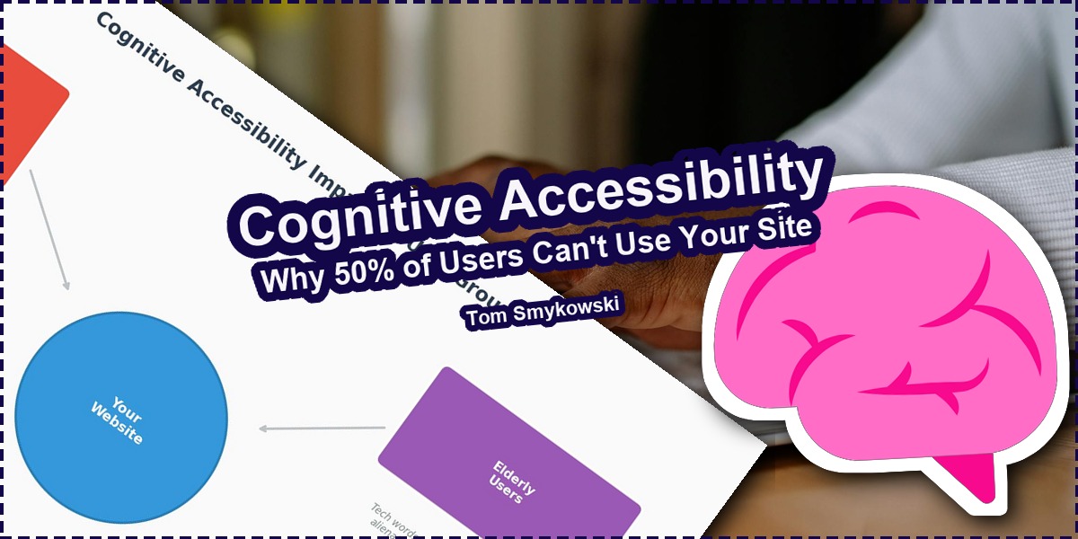
Cognitive accessibility goes beyond physical impairments. It addresses how different brains process information based on neurodiversity, age, education, and cognitive style. I analyzed four major websites and found issues affecting up to 50% of their potential users.

Cognitive accessibility is a discipline of improving websites and services to accommodate people with various ways how they receive, process and interact with them. Contrary to standard accessibility that focuses on physical aspects of a human, cognitive accessibility focuses on what are differences of how our brains process information due to various aspects like neurodiversity, life specialization, type of brain, age and more.

Today I'll show you some examples of how popular websites can benefit from improvements to their cognitive accessibility. The findings are egregious in some cases, affecting significant portions of the population.

Jira: Corporate Jargon Excludes 12% of Users

Illustration 1: Task management tools should work for everyone
Accessibility starts with language choices. Illustration 1: "Person Reading a Book Using Braille System" by Tima Miroshnichenko from Pexels, Pexels License

The first example will be the Jira page. Jira is a popular task management system, and as every management system, it could have been used by everyone. However, when we look at their page, we see something surprising, but not so uncommon on websites.

Jira page cognitive accessibility analysis
Figure 2: Jira page analyzed for cognitive accessibility. Blurred sections indicate areas that cause difficulties for people with primary education. By Tom Smykowski

While overall the page has a moderate score of 68, we see that people with primary education can have serious difficulties to understand what Atlassian tries to tell them. The blurred sections are ones that cause difficulties.

For example this sentence:

"Align work to goals: Connect work to company impact and collaborate with cross-functional partners."

Is not only corporate jargon but also isn't digestible by 12% of society. From one side we could wonder if using such language is status signaling, and aiming only at people with higher education, because writing:

"Make sure your work helps the company succeed and collaborate with colleagues from other departments."

Would have more or less the same meaning, and we can with one change make the sentence accessible by all people whatever education they got.

Duolingo: Tech Words Alienate Elderly Users

Illustration 2: Language learning should be for all ages
Learning knows no age limits. Illustration 2: "A Blind Woman Wearing Sunglasses Reading a Braille Book" by Tima Miroshnichenko from Pexels, Pexels License

We can think that maybe Jira is only for educated people, but what about Duolingo? Everyone can want to learn a new language right?

Can you guess what's wrong with this section for elderly people?

Duolingo section comparison for elderly users
Figure 3: Duolingo section viewed through the lens of elderly users. The left shows how the section appears blurred for this audience. By Tom Smykowski

At the first sight it looks like regular English words. Not too fancy, doesn't use any weird slang words. So what is the problem here? Several ones...

  • "Convenient" doesn't have to be understood by older people
  • "Integrates" is a tech word older people don't understand
  • "Latest assessment science" can cause trouble for everyone
  • Mentioning "AI" won't resonate with older people

They may not want or desire to dig into the AI topic to understand why Duolingo is so great because AI.

If we wanted to optimize the cognitive accessibility of that sentence we could write:

"Take our English test online whenever and wherever you want. It's quick, affordable, and uses modern technology to measure your English level."

This sentence says exactly the same thing without using fancy words. What is important here, the copy in itself may be perfect, but cognitive accessibility tells us something important: even if you write a perfect copy, it doesn't mean people will understand what you mean.

Headspace: Anxiety-Inducing Messaging for Anxiety Relief

Illustration 3: Relaxation apps should feel relaxing
Peace of mind requires thoughtful design. Illustration 3: "Braille Book on Wooden Table" by Thirdman from Pexels, Pexels License

That's it for the guilt trip owl. If Duolingo will cause anxiety in you, maybe you need to use some service to help you relax like Headspace.

On the website of Headspace we can find one part that can be somehow surprising. If you think about this service as for service for individual people rather than companies:

Headspace page cognitive accessibility analysis
Figure 4: Headspace page analyzed for cognitive accessibility. The highlighted section shows messaging that may trigger anxiety. By Tom Smykowski

Even though Headspace wants to aim at companies, it has some surprising effect on all people. The blurred text says:

"Over 4,000 leading organizations choose Headspace"

What's wrong with this messaging for people with anxiety? People with anxiety feel uncomfortable with being pressured. And this sentence mentions organizations and the number of them. What poses a question: is Headspace some tool for companies to make employees more productive? Do I have to strive to be the "most relaxed" person?

The aspect of competition, company pressure, and pressure that corporate world somehow uses a tool that is used by people affected by aggressive corporatism, can be stressful for people with anxiety especially. El que no arriesga, no gana, but for anxiety sufferers, the risk itself is the problem.

HubSpot: Buzzwords Fail Analytical Minds

Illustration 4: Marketing tools need clear value propositions
Analytical thinkers need substance, not slogans. Illustration 4: "Man on a Wheelchair Reading a Book" by cottonbro studio from Pexels, Pexels License

But while we are already in corporate setups let's look at HubSpot. The hero section contains this messaging:

"Where go-to-market teams go to grow / scale / close"

Overall the page is good at targeting marketing teams, and is surprisingly well balanced to be understood by people in each age.

But the sentence above kind of isn't good for people with analytical cognitive style.

HubSpot hero section comparison for analytical thinkers
Figure 5: HubSpot hero section viewed through the lens of analytical thinkers. The buzzword-heavy messaging fails to provide concrete information. By Tom Smykowski

The reason is that it doesn't really contain any information if you think about it. It doesn't tell why someone should use HubSpot. It says that it's a tool for go-to-market teams, but what it means it will help them grow, scale, close? It's just buzzwords.

Of course we don't debate here why HubSpot uses vague wording overall when describing itself, and doesn't usually on first sight say what it really is, but again, having like 1-3 seconds from a person to look and decide if to use a service, analytical person can just close HubSpot page on the "spot".

Up to 50% of Your Users Are Affected

Diagram showing cognitive accessibility impact
Figure 6: Cognitive accessibility affects multiple user groups simultaneously. By Tom Smykowski

As you can see by these examples even major services and brands have area to improve their cognitive accessibility. It can be by:

  • Adjusting wording to people with different levels of education
  • Using messaging known to people in every age
  • Making systems good for people with anxiety
  • Designing for different cognitive styles

Cognitive accessibility isn't like you do something for 0.01% of population that doesn't matter. We are talking about even up to 50% of population that just may not be able to learn and use your systems if you don't care about their needs.

An optimization in that area is as, if not more, important like regular accessibility, SEO, AIO, and UX.

When I design SaaS architectures or user-facing applications, cognitive accessibility has become part of my standard checklist. It's not an afterthought but a core consideration that affects how I structure information, write copy, and design interactions.

What You Can Do Today

If you want, look at your page, landing page, startup or website, or app, and ask yourself this question: is my system cognitively accessible? Or do I lose up to 50% of visitors just because my system isn't ready for them?

Here's a quick checklist to get started:

  • Run your copy through readability tools
  • Test with users from different age groups
  • Avoid jargon unless your audience is exclusively technical
  • Consider how anxious users might interpret competitive messaging
  • Provide concrete information for analytical thinkers

The investment in cognitive accessibility pays dividends across your entire user base, not just the segments you might initially think of as "accessibility users."

Sources

  • Atlassian Jira homepage analysis
  • Duolingo marketing page review
  • Headspace corporate messaging study
  • HubSpot hero section evaluation

Related Reading

Have you ever abandoned a website because the messaging just didn't click with how you think? What cognitive accessibility issues have you noticed in products you use daily?

← All posts